What Does ‘Above the Fold’ Mean?
Above the fold (ATF) is the part of a webpage that you can see without scrolling down.
The fold is the bottom edge of this initial view. Anything below that line requires scrolling and is considered “below the fold.”
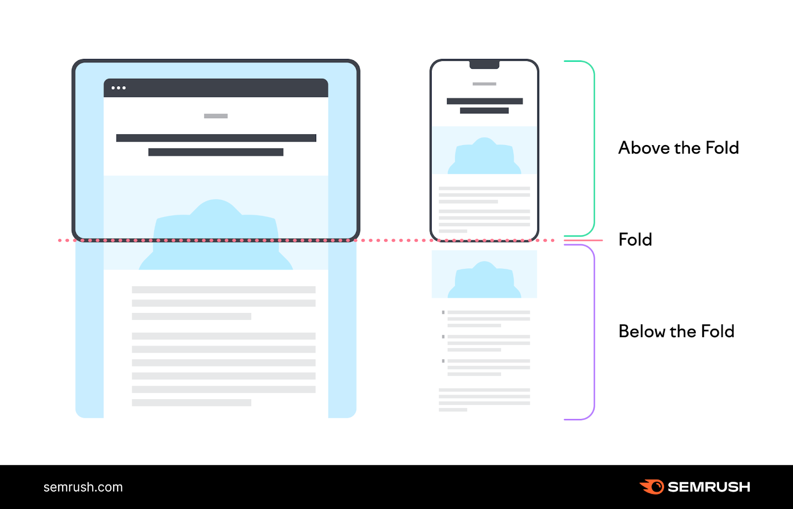
The exact fold line varies by device and browser settings. The size of the viewing window (also known as the viewport) affects where the fold appears.
Why Is Above the Fold Important?
Above the fold is important because it influences what visitors see first, helps capture their attention, and encourages them to stay on the webpage.
It shapes first impressions. Users often expect key features (e.g., a sign-up link) in this prime viewing area.
If they don’t find what they need right away, they may leave the page.
This behavior can harm business performance and SEO since search engines strive to deliver results that engage users.
Many search engines also consider near-the-top content more important. That means ATF content can have a greater impact on your rankings than below-the-fold content.
Above-the-fold SEO should, therefore, be a priority.
Above the Fold Best Practices
Above-the-fold content is essential for capturing visitors’ attention. It boosts user experience (UX) and can increase revenue.
Read on to learn more about ATF design best practices and above-the-fold SEO strategies that can help your pages rank higher in search engines.
Use a Responsive Website Design
A responsive website design adapts to the user’s viewport size and shape. It ensures images, text, and other elements fit properly.
This approach optimizes both above-the-fold and below-the-fold content across all devices, whether large desktop monitors or small smartphone screens.
Here’s an example of responsiveness in action on the Semrush blog:
For advice on implementing a responsive layout, consult Google’s help guide.
Then, run regular technical audits to check your site for performance issues.
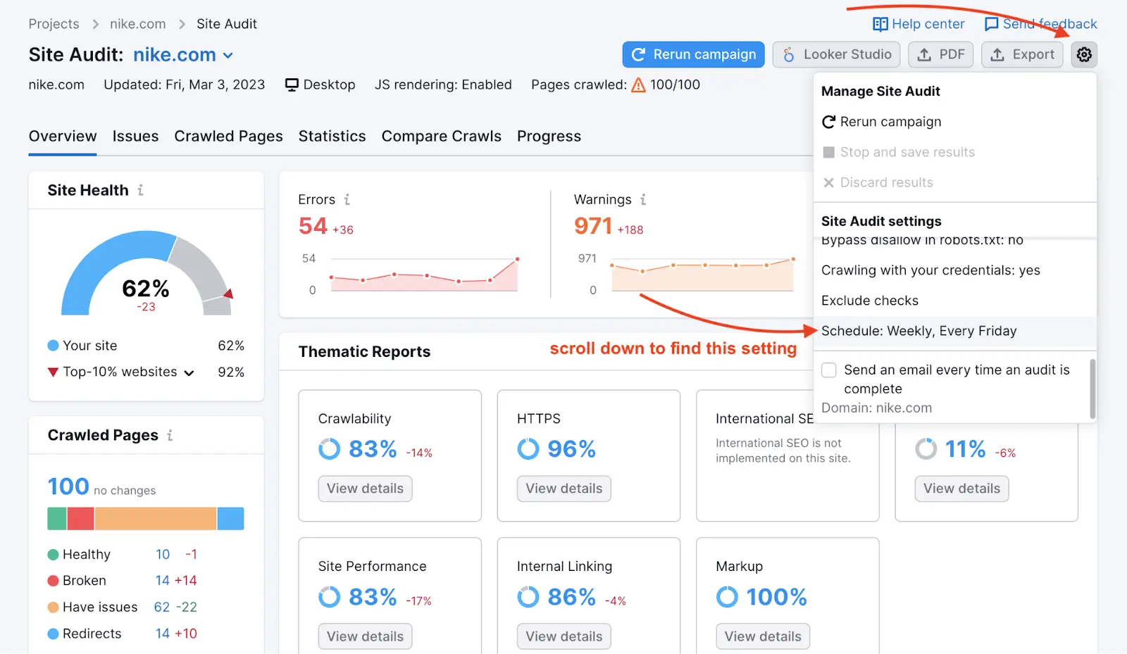
Semrush’s Site Audit tool performs over 140 checks to confirm performance on desktop and mobile devices.
You can schedule a daily or weekly audit, or re-run crawls manually.
Optimize Your Website Header
The website header sits at the top of a webpage and usually appears on every page of a site, keeping key elements in a consistent location.
This consistency helps users navigate your website.
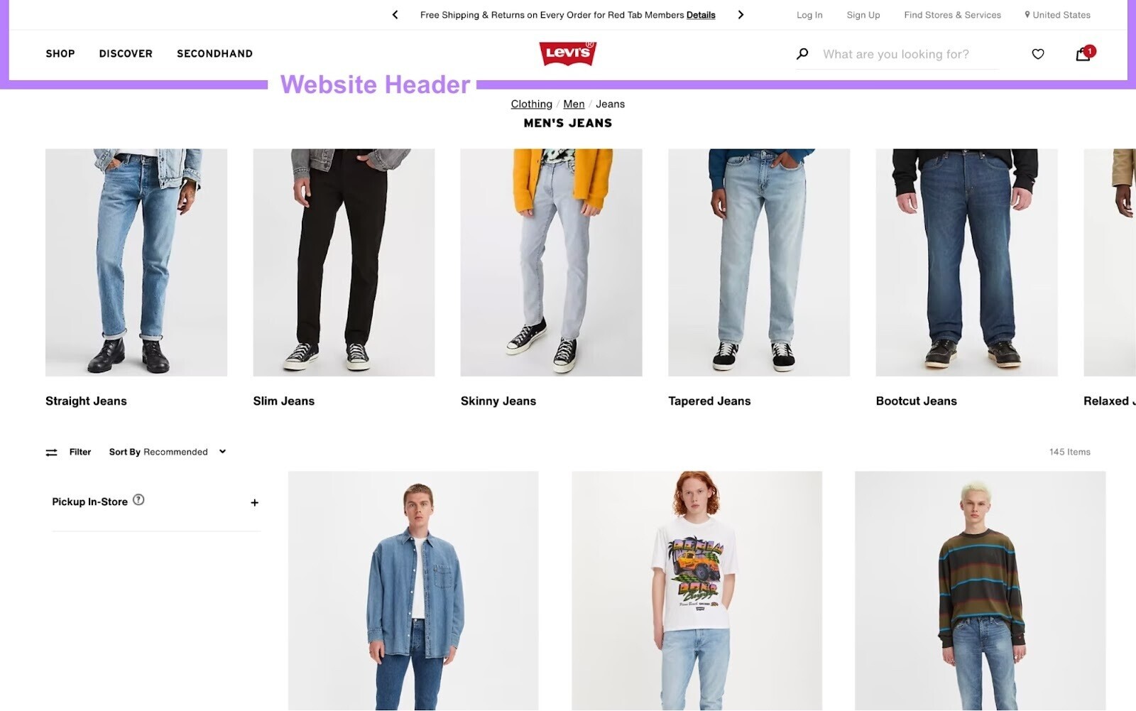
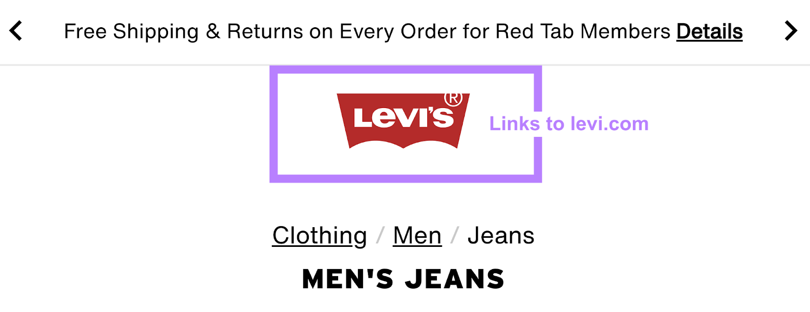
A header typically includes the brand logo, which links to the homepage.
The header also often includes the main navigation menu, which contains links to your site’s main sections.
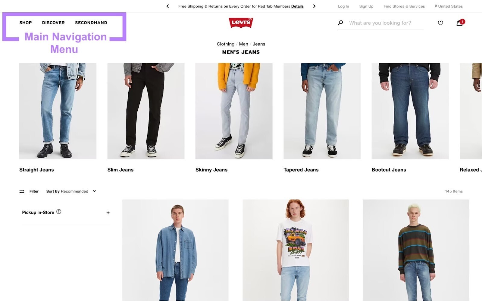
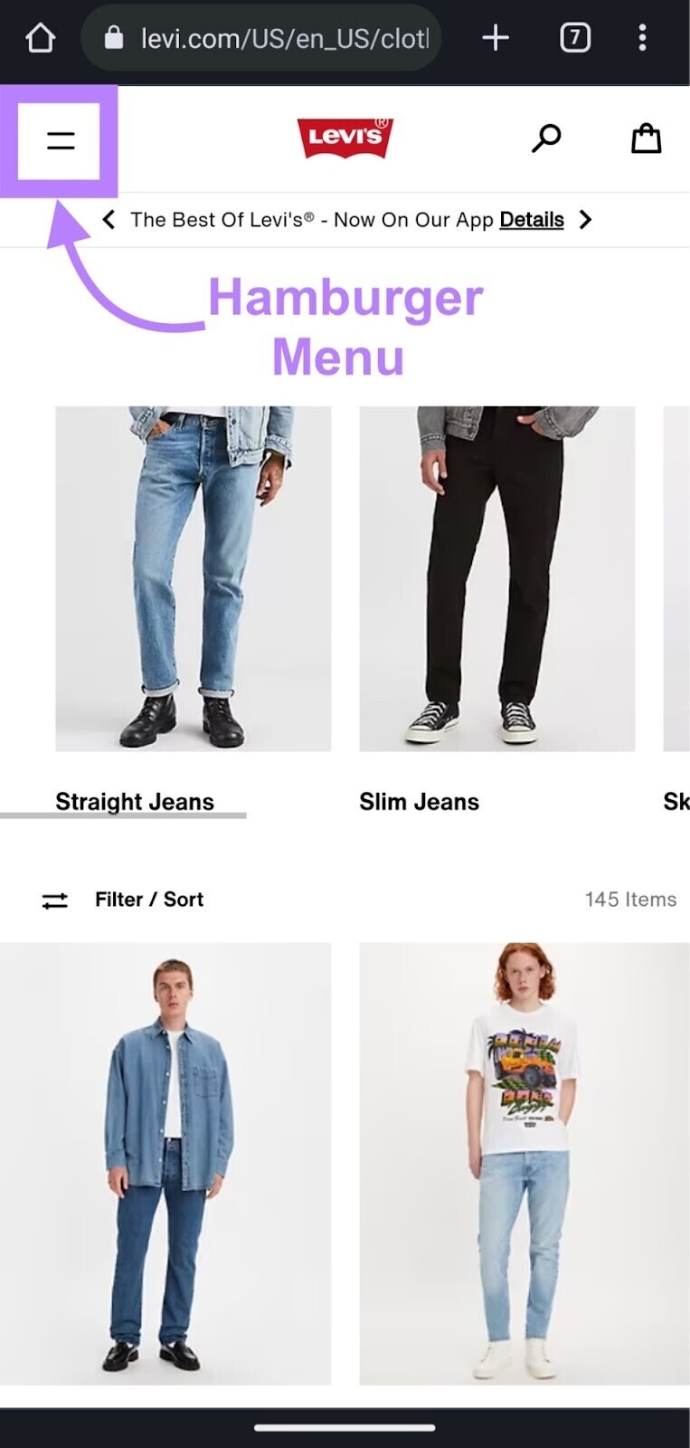
Many web designers save space by using a hamburger menu (especially on mobile). But this adds an extra click for users to reach key pages.
Here are other elements to consider for your header:
- Banner: Use the website banner to advertise unique selling points (e.g., free shipping)
- Sign-in or sign-up links: Encourage visitors to create an account or log in so you can get insights into customer behavior
- Region or language flag: Let users switch locales on multi-regional or multilingual sites
- Search function: Include a search bar or icon to help visitors quickly find what they want
- Shopping cart icon: Make starting the checkout process from any page easier

Adding more elements can increase functionality. However, a cluttered header occupies valuable above-the-fold space and can confuse users.
Designers must find a balance.
Include a Unique Heading
Each page should feature a unique, descriptive heading above the fold. This heading quickly shows users the page’s purpose.
On popular news sites, prominent headlines tell visitors exactly what to expect.
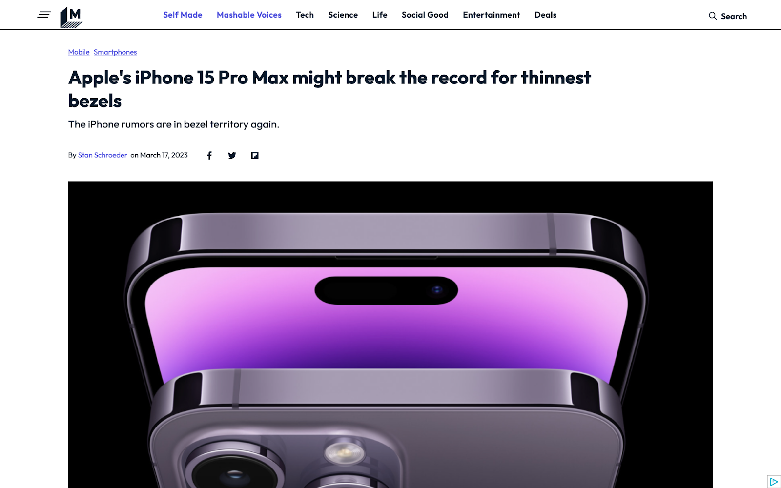
A unique heading also helps above-the-fold SEO.
When asked about ATF’s impact on rankings, Google’s John Mueller said, “The important part for us is really that there is some amount of unique content in the above-the-fold area.
“If you have a banner on top and a generic hero image on top, that’s totally fine. But some of the above-the-fold content should be unique for that page. And that could be something like a heading.”
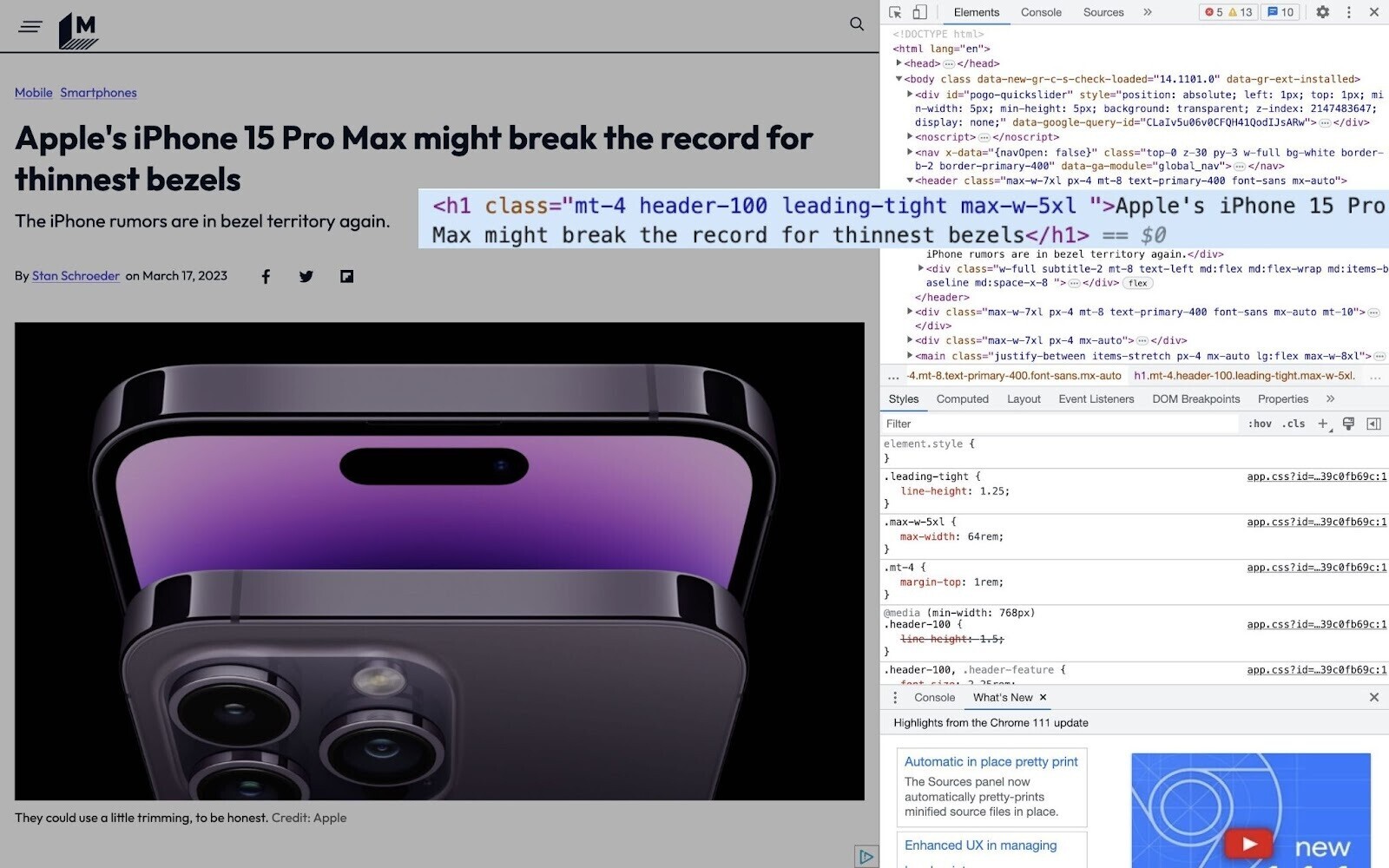
For on-page SEO, wrap the heading in H1 tags (the highest-level HTML heading). And make sure it includes your primary keyword.
Like this:
To review your current headings, use Semrush’s On Page SEO Checker.
Import your pages and target keywords. The tool then shows which headings to optimize.
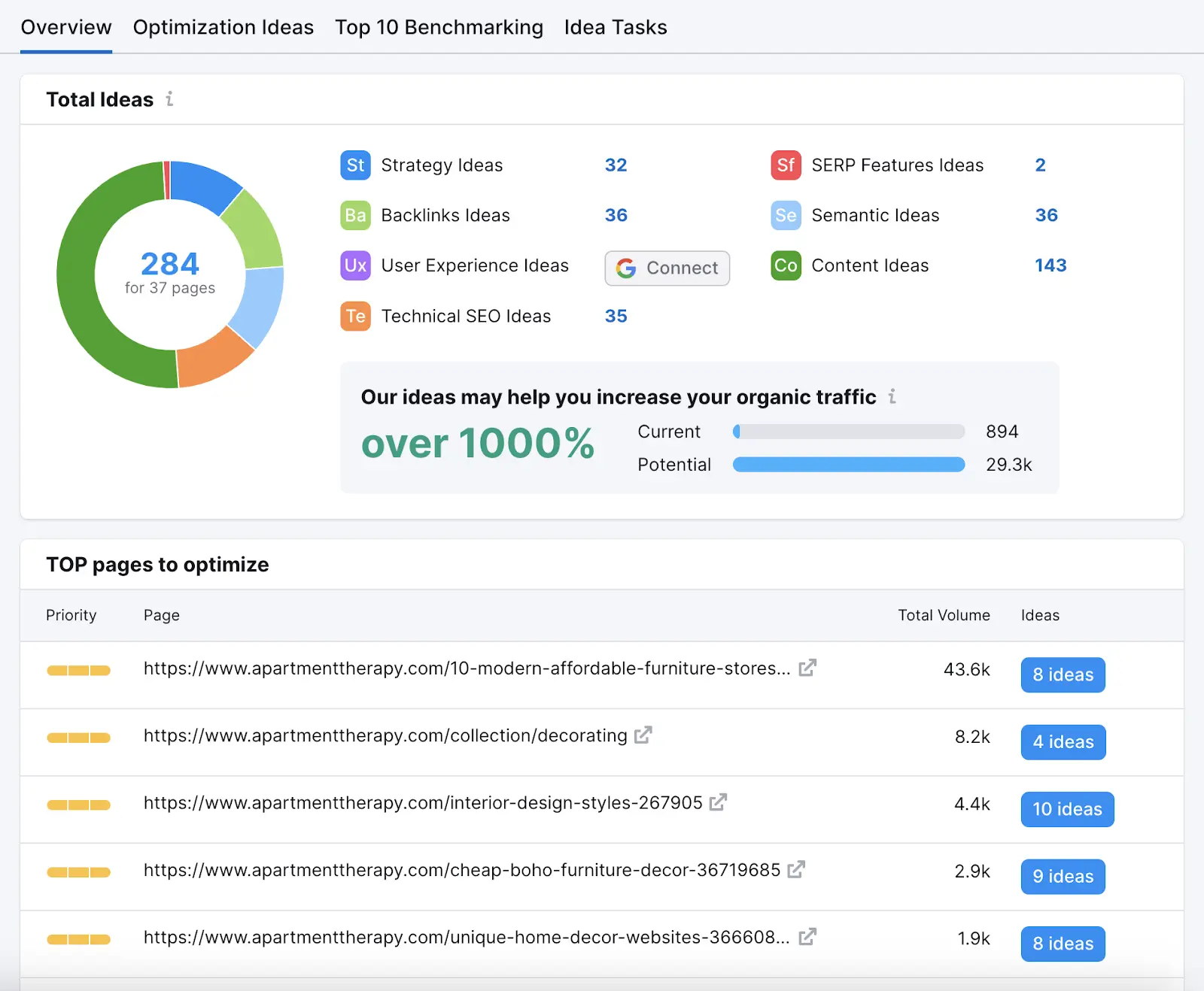
Open the ideas for any page to see whether the H1 contains your main keyword—and whether it’s overused (which can be one form of keyword stuffing).
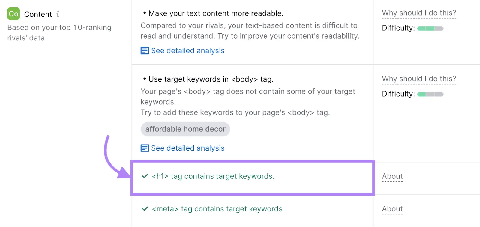
You’ll also see ideas related to:
- Title tags: Page titles that can appear in search results
- Meta descriptions: Descriptions that can appear in search results
- Semantic keywords: Conceptually related terms
And more.
Get to the Point
Users want to find what they need quickly—ideally above the fold.
Getting straight to the point is also called improving time to value, which benefits SEO and UX.
Before building a page, ask yourself the following questions:
- When someone lands on this page, what do they want to do?
- How can I help them do it as fast as possible?
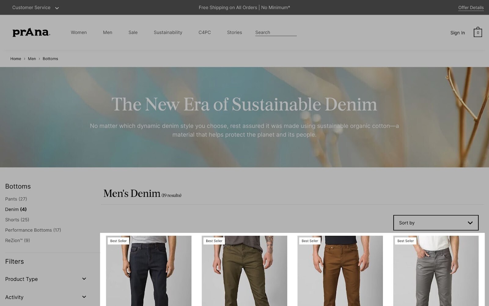
Consider category pages on retail sites. Shoppers see product options and photos immediately.
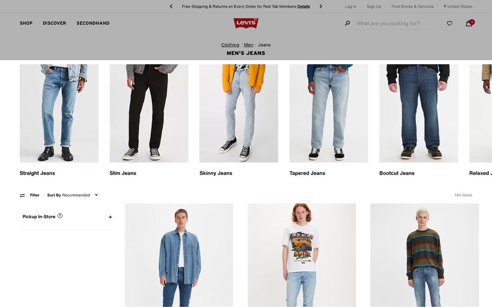
When most product images appear below the fold, visitors must scroll to see the items they came for, reducing immediate engagement.
Semrush’s blog template is also optimized to deliver value quickly.
The estimated reading time and table of contents appear at the top. Readers can dive into the article without scrolling past unnecessary visuals.
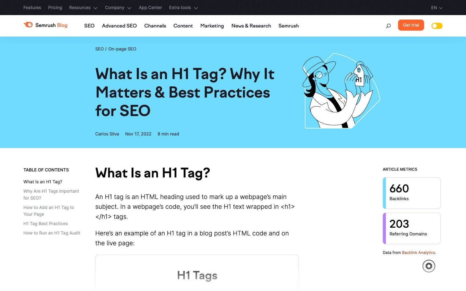
The writer uses an SEO copywriting technique called BLUF (bottom line up front). This approach delivers essential information right away. It avoids long, fluffy introductions.

Balance Ads with Original Content
You may want to display ads above the fold to increase visibility and clicks.
But too many ads can drive users away. Large or excessive ads can prevent visitors from quickly finding what they’re looking for, which may cause them to leave or look elsewhere.
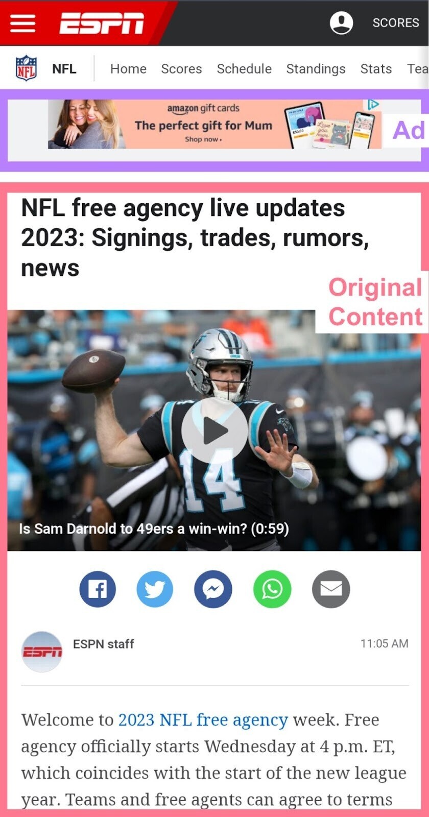
Unbalanced ads can also harm above-the-fold SEO, especially on smaller devices like mobile phones.
Search engines can penalize sites that fill too much top screen space with ads.
In 2012, Google released a major page layout algorithm update that demoted sites with excessive ATF ads.
The announcement stated: “If the part of the website you see first doesn’t have much visible content … that’s not a very good user experience. Such sites may not rank as highly going forward.”
Leading search engines advise following the Better Ads Standards. These guidelines discourage intrusive experiences like:
- Pop-up ads
- Large sticky ads
- Ad density above 30%
You can still use mobile ads above the fold, but balance it out with original content, like so:
Increase Loading Speeds
Your above-the-fold content should load quickly. Slow load times can increase bounce rates and hurt SEO rankings.
A set of speed metrics called Core Web Vitals is especially important:
- Largest Contentful Paint (LCP): Time for the largest text block or image to appear
- First Input Delay (FID): Time until the page responds to the first user interaction
- Cumulative Layout Shift (CLS): Amount of layout shifting during loading
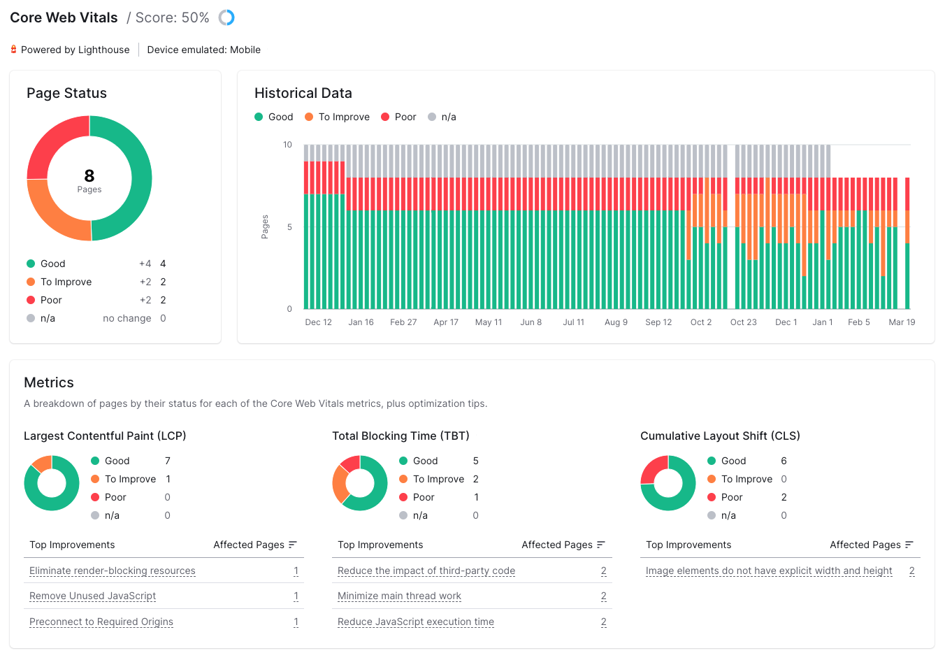
You can check Core Web Vitals in Google Search Console or Semrush’s Site Audit tool.
Semrush’s Core Web Vitals report shows key metrics and suggestions for improvement.
Below are some best practices for improving ATF load time:
- Structure your HTML so ATF content loads first
- Minify HTML, CSS, and JavaScript to reduce file sizes and speed up processing
- Inline critical CSS by placing above-the-fold styles in the <head> section to improve initial rendering
- Optimize images by resizing, reformatting, and compressing them to reduce load times while maintaining quality
- Preload resources using the rel="preload" attribute to prioritize loading above-the-fold elements.
Make It Look Good
Above-the-fold content should function well and look appealing, as visitors often form lasting impressions in a short amount of time.
Use these top tips for ATF design:
- Make text readable with a clear hierarchy
- Break up text and aid understanding with relevant visuals
- Include videos or animations to capture attention
- Use recognizable icons to save space
- Use empty space (white space) to reduce clutter
- Ensure the design aligns with brand identity
- Comply with accessibility guidelines
Analyze Performance Metrics
Performance metrics show what’s working in your ATF design and what needs improvement.
Your top metrics depend on site goals, but the following are useful. All are available in Google Analytics or similar platforms:
| Metric | Description | Why It Matters |
| The percentage of visitors who leave without taking action | Strong ATF content can lower bounce rates | |
| Exit rate | The percentage of visitors who leave your site from the current page | Strong ATF content can reduce exit rates |
| Scroll depth | The portion of the webpage your average visitor sees | Shows if ATF content motivates users to scroll further |
| Goal conversion rate | The percentage of visitors who complete a desired action (e.g., make a purchase) | Stronger ATF content can increase conversion rates |
| The number of unpaid visits from search engines | Good above-the-fold SEO can increase organic traffic |
For a single dashboard view, connect your Google Analytics and Search Console accounts to Semrush’s Organic Traffic Insights tool.
Then, compare the following metrics across your landing pages:
- Keyword rankings
- Bounce rate
- Goal completion rate
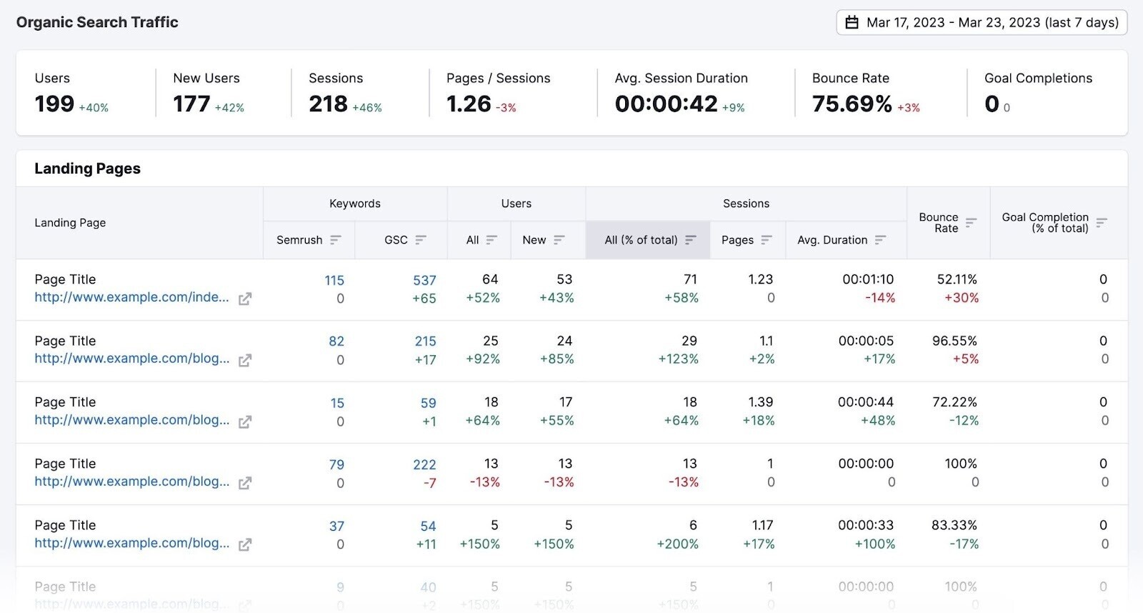
These insights can help you refine above-the-fold content to better meet user needs.
Should CTAs Be Above or Below the Fold?
Every landing page should have at least one call to action (CTA) that prompts visitors to take a specific action (e.g., “Add to Cart” or “Sign up Now”).
Some marketers place the CTA above the fold so users can see and interact with it right away.
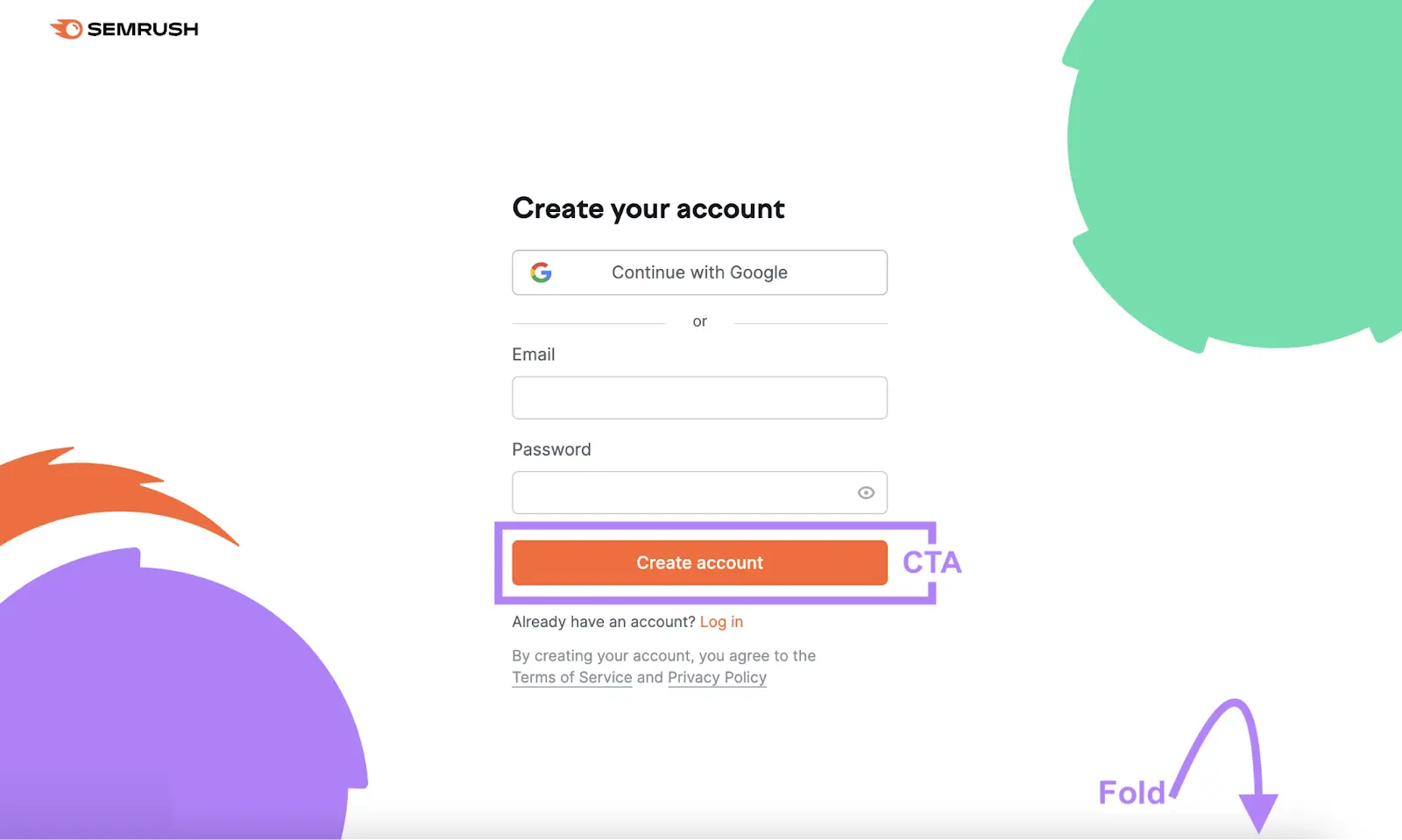
Others argue that visitors need more information before taking action. In those cases, placing the CTA further down (below the fold) might work better.
To find out what works best on your pages, conduct an A/B test (or split test):
- Decide which CTA placement to test and create a variant design
- Show the variant to 50% of visitors and the original design to the other 50%
- Fully implement the design that produces the best conversion rate
Above-the-Fold Website Examples
These above-the-fold (ATF) examples demonstrate best practices across different site types. Use them for inspiration when designing your own ATF layout.
Lush
As soon as a visitor lands on Lush’s homepage, they’re greeted with a bold, engaging product photo for the brand’s Mother’s Day campaign.
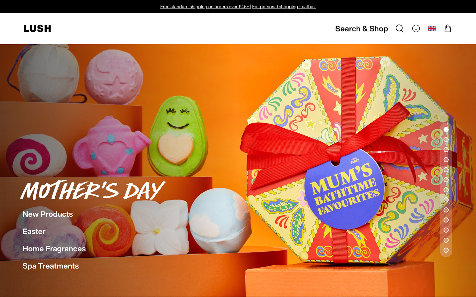
Links appear over the background image rather than in a standard navigation bar. This keeps the website header clean and focused on a specific promotion. A search function in the header helps shoppers find what they need quickly.
Circular indicators on the right show there’s more to see below the fold.
Kombu
Kombu’s product page is simple yet effective because it assumes that most visitors already know the product and are ready to order.
The above-the-fold design emphasizes the “add to cart” button on a high-contrast background.
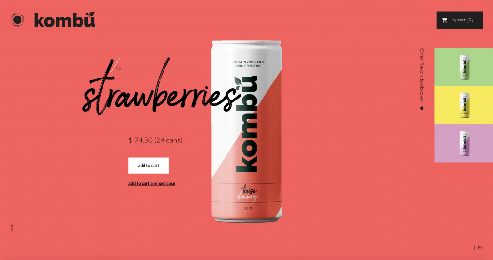
The minimal layout removes distractions and focuses on driving conversions.
A small “Scroll” prompt in the corner invites users to learn more if they choose.
Further reading: 17 Inspiring Product Page Examples (+ Best Practices for Yours)
ESPN
ESPN’s desktop home page contains a lot of ads, but it still adheres to recommended ad stands.
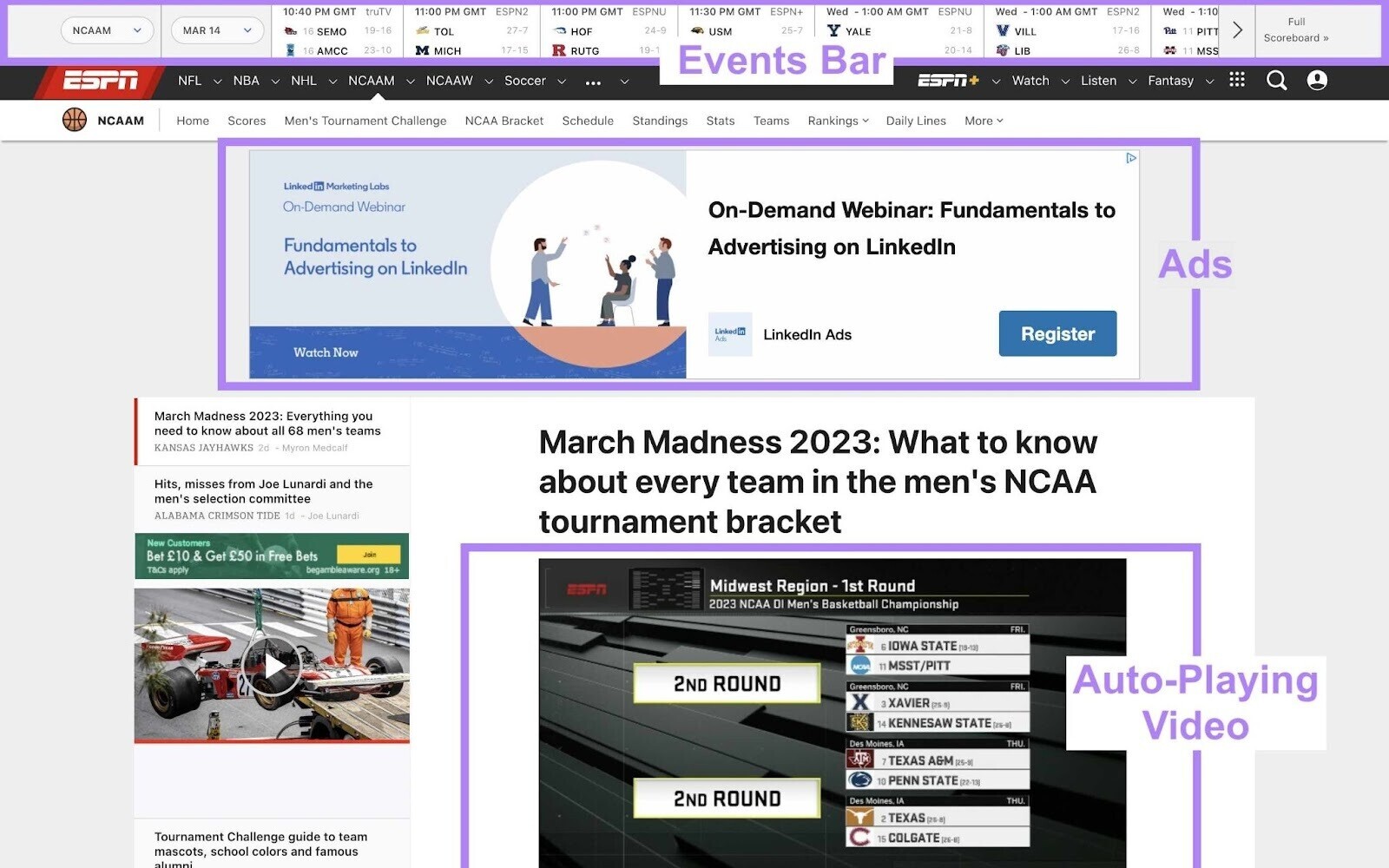
There are no pop-up ads, no auto-play video ads with sound, and no large sticky ads.
An “upcoming events” bar appears at the top of most pages. It automatically updates to the sport in view.
This feature delivers key information upfront and keeps users on-site.
A muted auto-playing video above the fold grabs attention and prompts further scrolling, aligning with better ad guidelines.
Smile Direct Club
Smile Direct Club’s homepage addresses its target market’s main concern by displaying pricing information in the above-the-fold banner, headline, and description.
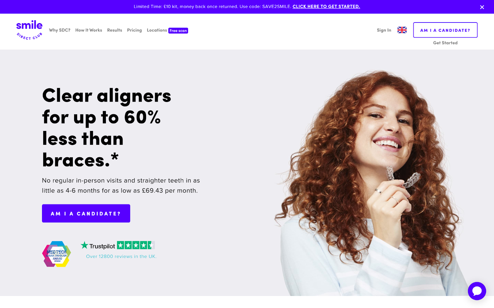
It also contains a product image and award logo to build trust. Trustpilot reviews reinforce the brand’s credibility.
Notice the CTA button appears twice above the fold (“Am I a Candidate?”). Users know exactly what step to take next.
More information is accessible through the navigation bar or the live chat feature in the corner.
Nordstrom
Nordstrom’s category pages have multiple navigational elements above the fold.
Tabs for product subcategories give an immediate sense of variety.
Meanwhile, filtering and sorting options keep users from feeling overwhelmed.
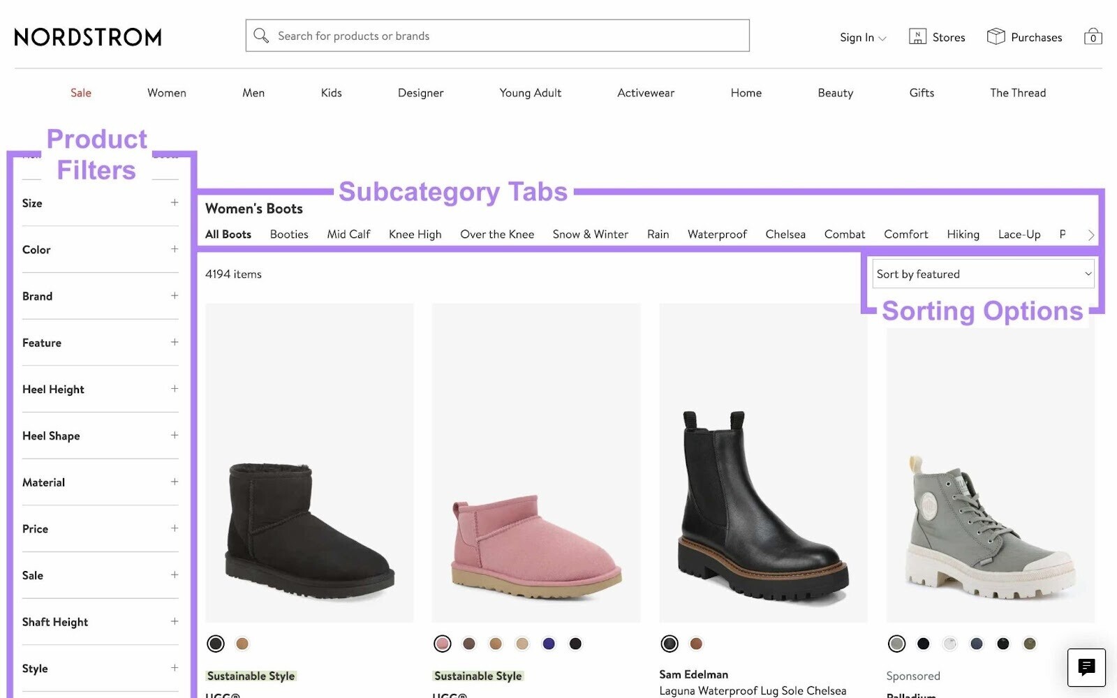
This balanced approach helps shoppers believe they can find the right product without an extensive search.
Airbnb
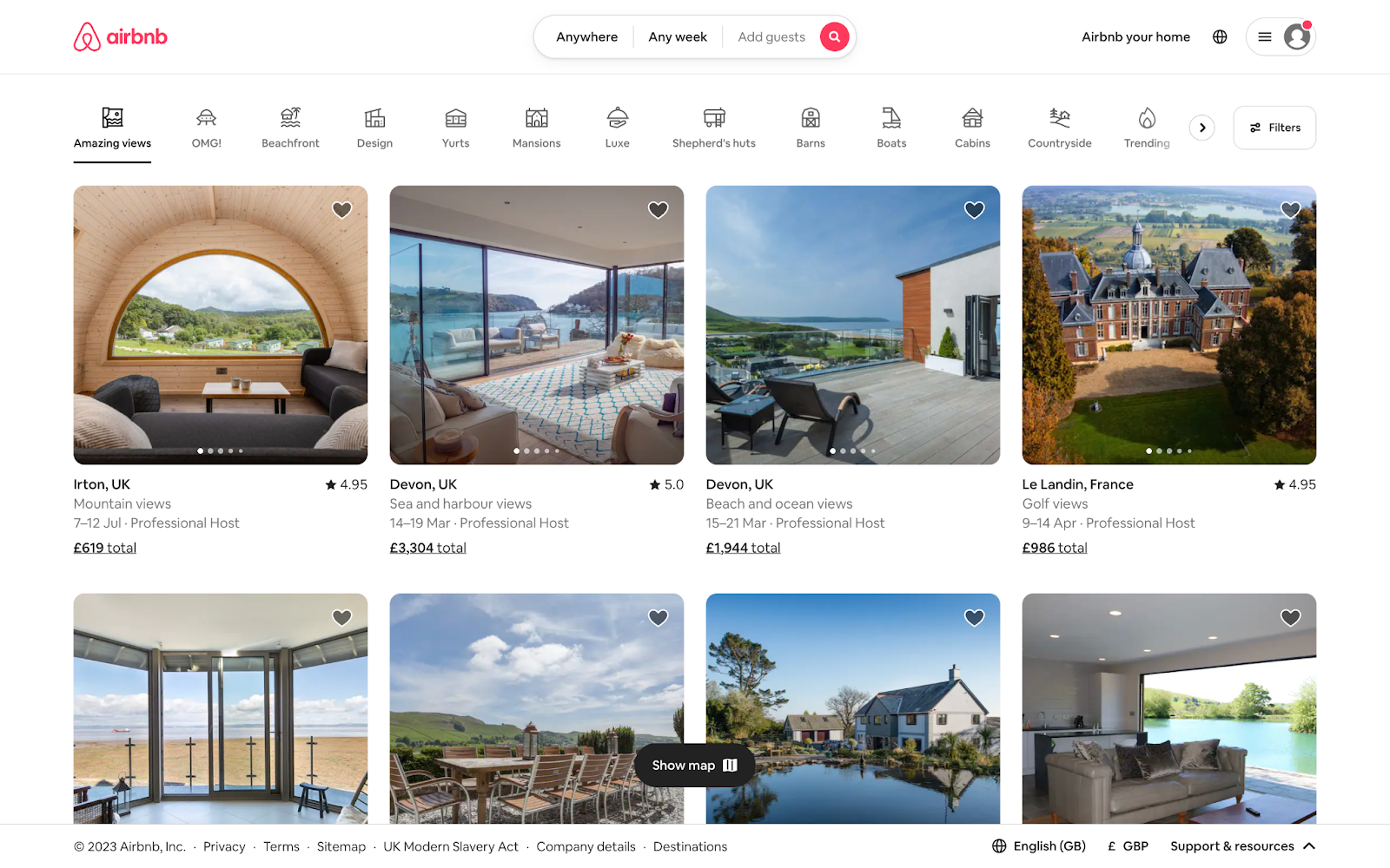
Airbnb’s travel-focused homepage positions essential navigation tools above the fold. Icons help users visualize accommodation options.
The layout devotes ample space to a featured set of listings with compelling images.
Each listing preview highlights crucial details like ratings, location, and price.
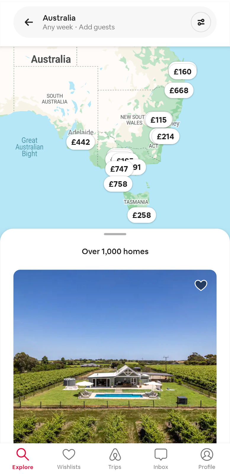
When a user searches, top results appear above the fold. A map also appears on desktop and mobile because location matters to travelers.
Make Improvements with Split Testing
When updating ATF content, compare key metrics before and after to confirm a positive impact. Better yet, use split testing to compare two above-the-fold designs:
- Create a new version of your ATF content (known as the variant)
- Serve the original version to half of the users and the variant to the other half
- Evaluate key metrics over a set time
- Implement the best-performing design
The SplitSignal app allows you to run these tests without coding or data science expertise.
You can measure the effect on organic traffic and other metrics to see which ATF design performs best.
